
Jewellery Showroom Interior Design: The Themed Store Guide

A themed jewellery store is a showroom where one idea, taken from the brand's own story, decides the layout, the materials, the light and the sequence a customer walks through. Done well, it brings in buyers who would never walk into a traditional jewellery showroom, keeps them inside longer and gives a growing brand a format it can repeat in the next city. Done badly, it is a costume that dates in two years. This guide covers why themed jewellery stores work, how they help a jewellery business grow, and the seven steps we follow to design one, with examples from Kosmos, a Greek heritage jewellery store concept we designed for a lifestyle jewellery brand in Bengaluru.
Key takeaways
- A theme works when it is a system of proportion, light and sequence, not a layer of decoration.
- Plan by depth: everyday pieces at the front, considered pieces mid-store, bridal at the back, so price, privacy and time spent rise as people walk in.
- Light the jewellery, not the room. Four layers of light do more for a showroom than any amount of ornament.
- Use real materials and repeat one module. That is what makes a themed store affordable to build twice.
- Decide what you will measure before you build: walk-ins, time in store, seated consultations and average bill.
Why are jewellery brands turning to themed stores?
Because the product alone no longer separates one jeweller from the next. From the pavement, a gold chain in one window looks much like a gold chain in the window next door, and the buyer brands most want to win, younger and buying for themselves, does not shop the way a wedding family does. A traditional showroom built around long counters, bright overhead light and staff behind glass says "serious purchase, come back when you are ready". That is the right message for a bridal order and the wrong one for someone buying their first pair of diamond studs.
A theme changes the first impression from "shop" to "place". It gives people a reason to step in before they have decided to buy, a story to tell their friends, and something worth photographing. For the brand, the theme becomes a physical version of its identity that no competitor can copy without looking like a copy.
How does a themed jewellery store help the business grow?
Through five levers that can each be designed for and measured. The design does not replace good selling, it removes the friction that stops good selling from starting.
| Growth lever | How the design creates it | What to measure |
|---|---|---|
| New walk-ins | A window with one hero display, visible from the street, and an open front hall with no counter barrier | Footfall versus passers-by, first-time visitors |
| Longer visits | A sequence of spaces that pulls people deeper, family seating, try-on points that need no staff | Average time in store |
| More consultations | Seated counters and private rooms that make it easy to sit down and look closely | Walk-in to seated consultation rate |
| Higher average bill | Considered and bridal pieces placed deeper, where buyers have time and privacy | Average bill value, conversion by zone |
| A format that scales | One module and one material system that can be rebuilt in another city at a known cost | Fit-out cost per sq ft, time from lease to opening |
One honest caution: a theme cannot rescue a weak range, poor pricing or a bad location. It multiplies what is already there.
Theme or gimmick: where is the line?
The line is whether the theme earns its place. A useful test: if you removed the theme, would the store still be well planned? If the answer is no, the theme is covering for bad planning. Here is the rulebook we used on Kosmos.
| Use freely | Use once, with intent | Avoid |
|---|---|---|
| A repeated module, like a pilaster and niche bay | A single arch or crowning gesture | Printed murals and photo wallpaper |
| Real stone, plaster, metal and glass | One hero object, like a sculpture | Faux ruins, fibreglass columns, fake ageing |
| Ornament at touch scale: a door pull, an inlay, an edge | One relief artwork | Statues and props used as filler |
When does a theme not make sense at all? When you sell gold by weight to price-led buyers in a high-footfall market, a fast, bright, efficient counter will usually beat a slow, atmospheric room. And if the brand has no story of its own, borrowing someone else's will feel thin. Fix the brand first.
How to design a themed jewellery store in 7 steps
Step 1. Turn the brand story into one design rule
Start from what the brand already says, not from a mood board. The brand behind Kosmos names its eight collections after figures from Greek myth, so the store had a ready-made source. We condensed it into one line that settled every later argument: architecture first, jewellery second, mythology woven through the details. Write your own rule in one sentence before drawing anything.
Step 2. Borrow a grammar, not a costume
Every strong architectural tradition is a system of proportion and rhythm. Borrow the system and leave the ruins behind. For Kosmos we took the Ionic order, the most slender and graceful of the classical orders, and reduced it to line, flute and geometry. A column becomes a slim fluted pilaster. The pilasters frame jewellery niches. The same move works with a Mughal arch, a Chettinad pillar or a Kerala timber bay.
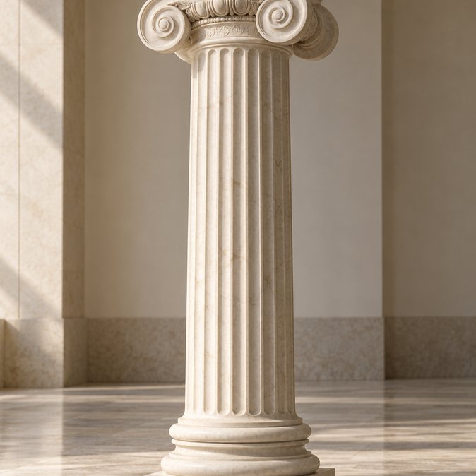
The reference: a classical Ionic column.
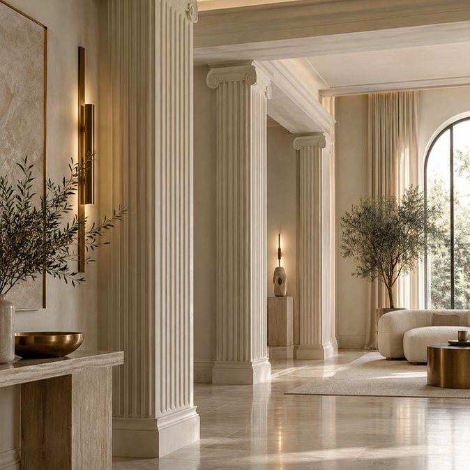
The interpretation: the same column, simplified for a contemporary interior.

In the store: slim pilasters framing a jewellery niche. Reference, interpretation, application.
The same three-step move turns the classical entablature, the band of stone above the columns, into a lit frieze that runs above the display wall, carries the collection names and hides the light that washes down onto the jewellery.

The reference: a classical entablature.

In the store: a continuous lit frieze above the display wall.
Step 3. Plan by depth: price, privacy and time rise as you walk in
This is the single most useful layout rule for a jewellery store. Put everyday pieces, gifts and new launches at the front, where people can browse without help. Put considered pieces such as engagement rings and gemstones mid-store, at a seated counter. Put bridal at the back, in a private room with space for the family. In Kosmos, a 1,290 sq ft shell holds a 360 sq ft front hall, 450 sq ft of gallery and sanctum, a 230 sq ft bridal salon and about 180 sq ft of service and strongroom, all off the customer path.

A zoning plan for a 1,290 sq ft jewellery store. Price, privacy and time spent rise from left to right.
Two axes make the plan easy to read. A main axis runs straight from the door to a hero display, so people see the best thing in the store from the street. A second axis leads past the seated counter to the bridal salon.
Step 4. Design the walls as display bays, not shelves
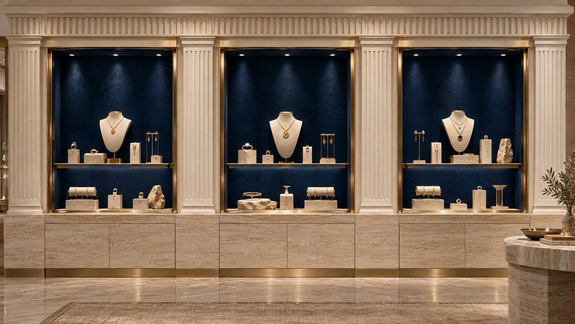
Organise every display wall as a repeating bay: pilaster, niche, pilaster. Line the niche backs in a dark fabric such as cobalt suede, because a dark ground makes gold and diamonds glow. Keep the hero zone at eye level, roughly 1100 to 1600 mm from the floor, put storage in a stone plinth below, and use ultra-clear glass with minimal frames.

A five-bay display wall: one module, repeated, so the wall reads as architecture instead of furniture.
Lift what matters. A stepped stone plinth under a hero vitrine does the same job a temple platform did: it tells the eye this piece is important.
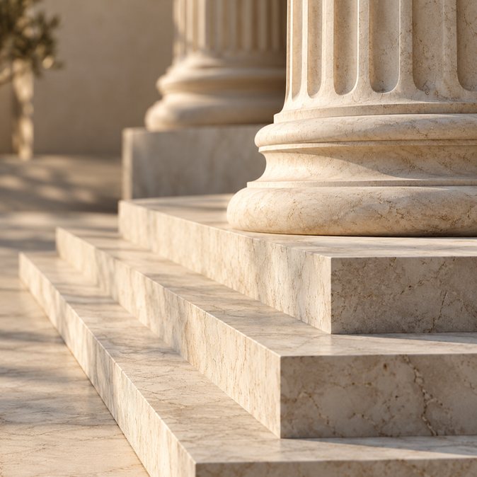
The reference: the stepped stone platform of a temple.

In the store: one hero piece, lifted and framed.
Step 5. Light the jewellery, not the room
Most showrooms are lit too evenly and too brightly, so the jewellery competes with the ceiling. Light in four layers instead, and keep the room a little darker than the displays.
| Layer | Job | Specification we use |
|---|---|---|
| Ambient | Soft, indirect light from coves | Warm white, 2700K to 3000K, no visible glare |
| Architectural | Grazing light on textured walls and lit friezes | Gives the room rhythm after dark |
| Accent | Narrow-beam light on each piece | CRI 95 or higher, warmer for yellow gold, cooler for diamonds and pearls |
| Feature | Halos, backlit stone, glowing plinths | Light used as architecture at the focal points |

Accent light: a narrow beam on the piece, a dark ground behind it.
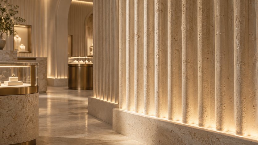
Architectural light: grazing light on fluting.
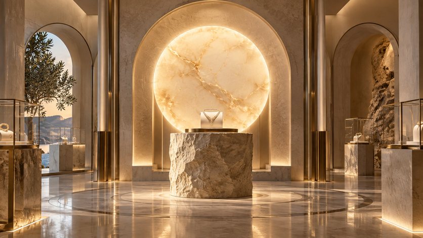
Feature light: backlit stone at the focal point.
One more rule from the Kosmos bridal salon: never put hard downlights over the face at a try-on table. Soft, flattering light at face height sells more than any spotlight on the tray.
Step 6. Choose real materials and fix the colour proportions
Real stone, lime plaster, brass, onyx and glass cost more than laminates and prints, but jewellery buyers notice the difference at once, and real materials age well instead of dating. Fix the proportions before you choose finishes. Kosmos uses about 70 percent stone and plaster, 15 percent cobalt and deep night, 10 percent gold and under 5 percent soft accents, with the darkest colours only inside the displays.

A complete material palette for a luxury jewellery store, with where each material goes.

Flooring that leads the way: a Greek-key border marks the zones quietly.
Step 7. Plan for selling, security and families before you go to 3D
A jewellery store is also a vault, a workshop and a waiting room. Settle these before anyone renders a single view:
- Seating. A seated counter for considered pieces and a private room for bridal. In Kosmos the treasury counter seats six and the bridal salon seats six across two tables.
- Families. Indian jewellery is rarely bought alone, so give the family a lounge mid-store and seating by the door.
- Billing and security. Put billing where all routes meet, keep a windowless strongroom, and make sure the stock route never crosses the entrance.
- Craft on show. A jeweller's bench for sizing, engraving and cleaning in view builds trust that no brochure can.

Consultation, not counter selling: a stone table, suede trays and soft light at face height.

The bridal salon of Kosmos: the most private room, at the deepest point of the plan.
What should a jewellery store window do?
One thing: stop people. A window crowded with every collection says nothing. Kosmos uses a single classical bust that wears the season's hero piece and is restyled at every launch, with the main axis running straight behind her to a glowing hero display inside. The window becomes a reason to look in, and the axis becomes a reason to walk in.
One hero, restyled every season, does more than a crowded window.
How long does it take, and what does it cost?
For Kosmos, the concept was presented in September 2026, and the full layout and photoreal 3D followed in October 2026. Build time and cost depend on the site, the stone, the custom vitrines, the lighting and the security spec, so we price every store from a frozen layout and a bill of quantities, never from a rate per square foot quoted before the design exists. If someone quotes a themed jewellery store before seeing your floor plan, ask what they have left out.
See the full case study
Every example in this guide comes from one real concept. The Kosmos case study walks through the whole store, from the street window to the bridal salon, with the plans, the material palette and the lighting design.

The seated treasury salon in the Kosmos concept.
Common questions
What is a themed jewellery store?
A themed jewellery store is a showroom where one idea from the brand's story, such as a culture, an era or a myth, sets the layout, materials, lighting and customer journey. The theme should work as a design system rather than decoration, so the store still functions well if you ignore the story.
Does a themed design work for a small jewellery shop?
Yes, if you keep it to the essentials: one repeated display module, one hero display on a clear axis from the door and one seated area. A small shop cannot carry many ideas, so pick one and execute it with real materials and good light.
Which theme suits an Indian jewellery brand?
The one your brand can defend. If your collections or story come from a culture, a craft or a place, borrow that tradition's proportions and materials. A Greek theme works for Kosmos because the brand already names its collections after Greek myths.
What is the best lighting for gold and diamond jewellery?
Use narrow-beam accent lights with a colour rendering index of 95 or higher, slightly warmer for yellow gold and slightly cooler for diamonds, platinum and pearls, over a softer, warmer ambient light of about 2700K to 3000K. Keep the room darker than the displays.
How should a jewellery store layout be planned?
Plan by depth. Everyday pieces and gifts go near the entrance for easy browsing, considered pieces go mid-store at seated counters, and bridal goes at the back in a private room, with billing where routes meet and the strongroom off the customer path.
Can a themed jewellery store be rolled out to other cities?
Yes, if it is designed as a system. One display module, one material palette and one lighting specification can be rebuilt in a different shell at a known cost. Themes made of one-off props and murals are much harder and costlier to repeat.
Can Kaizeng design a themed concept for my jewellery store?
Yes. We design concepts from your own brand story and site, then take them through layout, 3D, BOQ and execution. Each concept belongs to the brand it was made for, so we never reuse one brand's concept for another.
Planning a jewellery showroom, a flagship or a mall store? See our work on Concepts by Kaizeng, or send us your floor plan on WhatsApp and we will tell you what a concept for your site would involve.
